 Feeling blue? Were you green with envy or tickled pink? How about that annoying sales call that you received during dinner that made you red in the face? It’s not unusual for people to describe their mood in terms of color. In fact, it’s quite common. But did you know that colors can affect your actual mood? That’s right. The colors you choose to surround yourself with can affect how you act, think and feel, which is why color scheme is so important to a room’s décor (on top of making the room look great). And this is why each year we pay attention to The Pantone Color Institute’s Color of the Year.
If you’re not familiar with it, The Pantone Color Institute is considered to be the governing body on color. Each December, following an analysis of color trends that have occurred throughout the year, with close attention paid to colors that have appeared in branding efforts, Pantone announces a Color of the Year. The hue that it chooses has become influential in the world of design and brand marketing and products ranging from fashion to appliances to interior décor will be designed by companies with the color in mind. So yeah, the color tends to be a big deal.
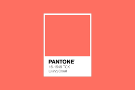
For 2019, Pantone announced Living Coral as its Color of the Year. Although the color appears more pink in nature, its described by Pantone as “an animating and life-affirming coral hue with a golden undertone that energizes and enlivens with a softer edge”. While you may not want to paint your entire house this color, a splash of Living Coral can bring buoyancy and warmth to any room reminiscent of the energy and familiarity found in nature.
Historically, paint companies follow similar trends in naming their color of the year. But for 2019, there is some divergence. Similar to the Pantone Institute, Sherwin Williams (Cavern Clay) and PPG (Nightwatch) have chosen colors that bring the power of nature indoors with their choices. However, Behr (BluePrint) and Benjamin Moore (Metropolitan) have continued with the gray/blue tones that were prominent in 2018. Turning 10 years old this year, Valspar marks it’s first decade in business by naming not one but twelve colors of the year. Their shades reflect soft colors like Rosy Mauve and Illuminated Violet, and Sea Green and Natural Olive.
“I found I could say things with colors that I couldn’t say in any other way – things that I had no words for.” – Georgia O’Keeffe
 Never miss important New Jersey real estate news or changing market conditions!
  Subscribe here to have New Jersey blog posts and monthly home sale stats delivered to your email inbox.